CASE STUDY · EDUCATION & YOUTH DESIGN SPRINT

Future Creatives: Brand Identity & Graphic Design Systems

How a group of high school students at FWCS Career Academy went from blank sketchbooks to full strategic brand briefs, curated moodboards, and digital style tiles in a single 3-hour agency sprint.

Partner / Host: Fort Wayne Community Schools (FWCS) Career Academy

Facilitator: BKX Studio (Brandon Coley, Creative Director)

Format: 3-Hour Interactive Agency Sprint (Sept 22, 2026)

Deliverables: Digital Brand Vibe Check Briefs, 6–8 Image Moodboards, Paper Concept Labs & Canva Style Tiles

01 DISCOVER→
02 DEFINE →
03 DESIGN →
04 PRESENT
EXECUTIVE SUMMARY

Shifting the Mindset: A Logo Is Not a Brand

Most introductory graphic design classes ask students to jump straight into drawing a logo. During our Future Creatives: Brand Identity Workshop at FWCS Career Academy, BKX Studio flipped that script by running the classroom like a live creative agency.

Students were guided through four core pillars—Strategy, Voice, Visuals, and Experience—using a custom interactive web portal on bkxstudio.com paired with hands-on paper sketching and touchscreen Chromebooks.

Core Workshop Philosophy: A logo is just one signal. A brand is the full feeling people carry with them—and design is empathy made visible.

⚡ Sprint Snapshot

✓ 100% Engagement: Every student completed a digital brief, sketch lab, and visual system.

✓ Hybrid Workflow: Custom web portal + analog paper sketching + Canva execution.

✓ Next Up: Session 2 (Social Media Content for Professional Branding) slated for Nov 17, 2026.

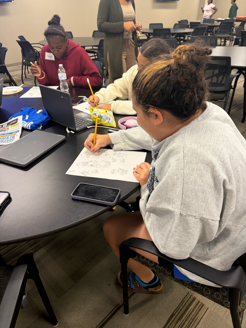
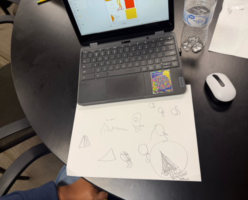
01 / Analog Ideation: Rapid character and mascot sketching on paper before touching digital tools.

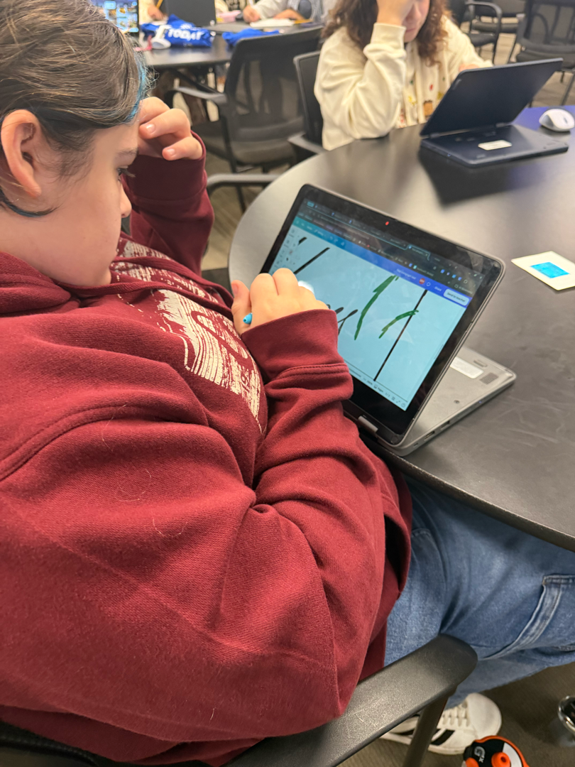
02 / Digital Drafting: Refining line work and layout geometry directly on touchscreen Chromebooks.

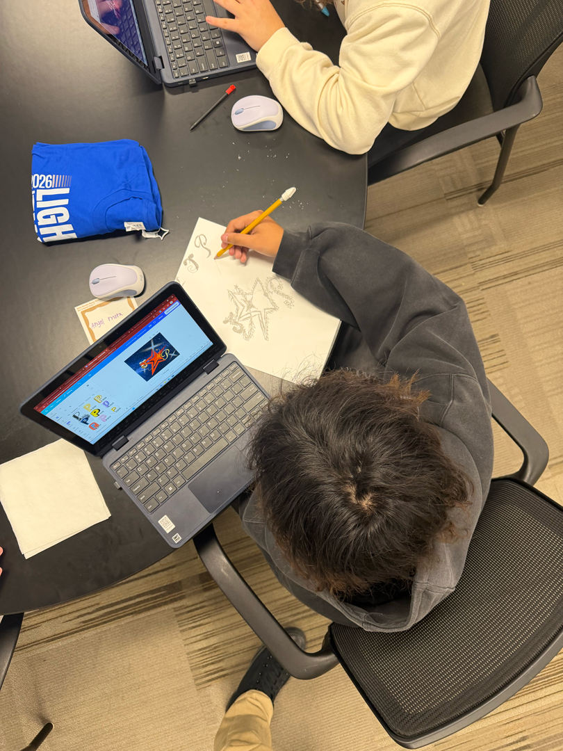
03 / Paper-to-Pixel: Translating hand-drawn star and monogram sketches into high-contrast Canva graphics.

PHASE 01 & 02
DISCOVER & DEFINE: THE DIGITAL “BRAND VIBE CHECK”

Before sketching a single mark, students selected a mock client challenge from the BKX Studio Agency Prompt Bank or pitched an original concept. They then submitted their strategic foundation through our live Brand Vibe Check questionnaire—locking in their target audience, mission, and visual guardrails.

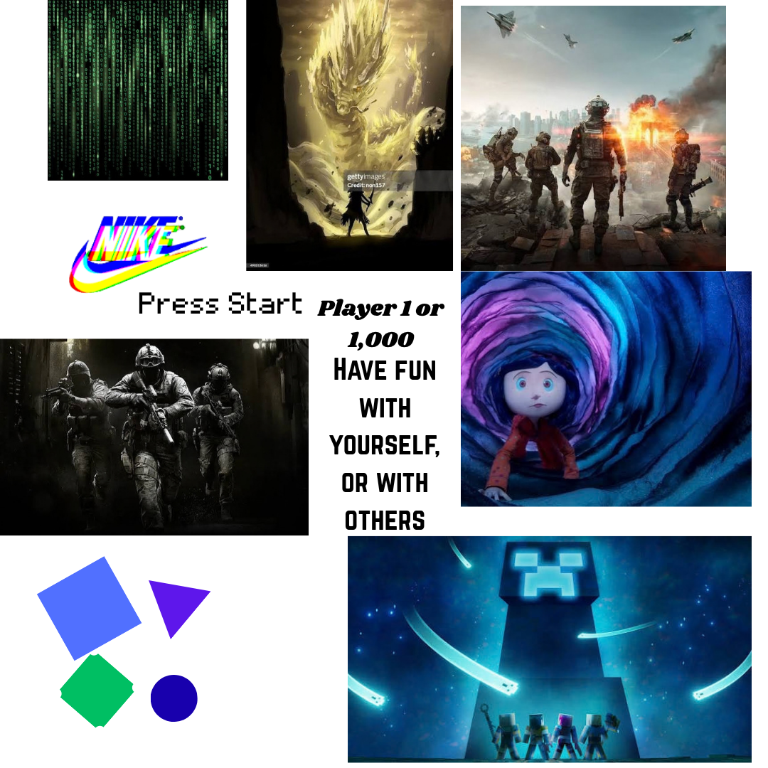
GAMING & TECH

PRESS START

“Player 1 or 1,000 — Collaborate with others to achieve victory and happiness.”

Creative Director: William F. Garcia

Audience Persona: 15–16 yr olds in baggy clothes & Crocs with gaming charms, hanging out in LED-lit rooms watching game lore and chatting on Discord.

Visual Vibe: Sleek & Techy / Cyber

Design Guardrails: Do’s: Dark colors, big font, sleek glitchy graphics. Don’ts: Bright colors, small fonts, bland style.

BOTANICAL & RETRO

DEMETER’S DARLINGS

“Grow up with the trees!”

Creative Director: Kaley Moring

Audience Persona: Young adults and teenagers who have taken a hands-on interest in cultivating plants, botanicals, and herbs.

Visual Vibe: Retro / Nostalgic

System Goal: Showcase a curated botanical gallery and book collaborative projects through warm, nostalgic iconography.

COMMUNITY SPACE

SAFEPLACE

“Makes a late-night fun and safe.”

Creative Director: Emmaleigha Szabo-McCloskey

Audience Need: A welcoming late-night environment where teens and young adults can hang out without worrying about safety.

Visual Vibe: Clean & Chill

Brand Ethos: “Do anything—just be safe and kind. Do not be unkind and disrespectful.”

Visual Direction in Action (Press Start): Translating written brand rules directly into a cyber/glitch moodboard with Matrix textures, pixel type, and a 4-color gaming palette.

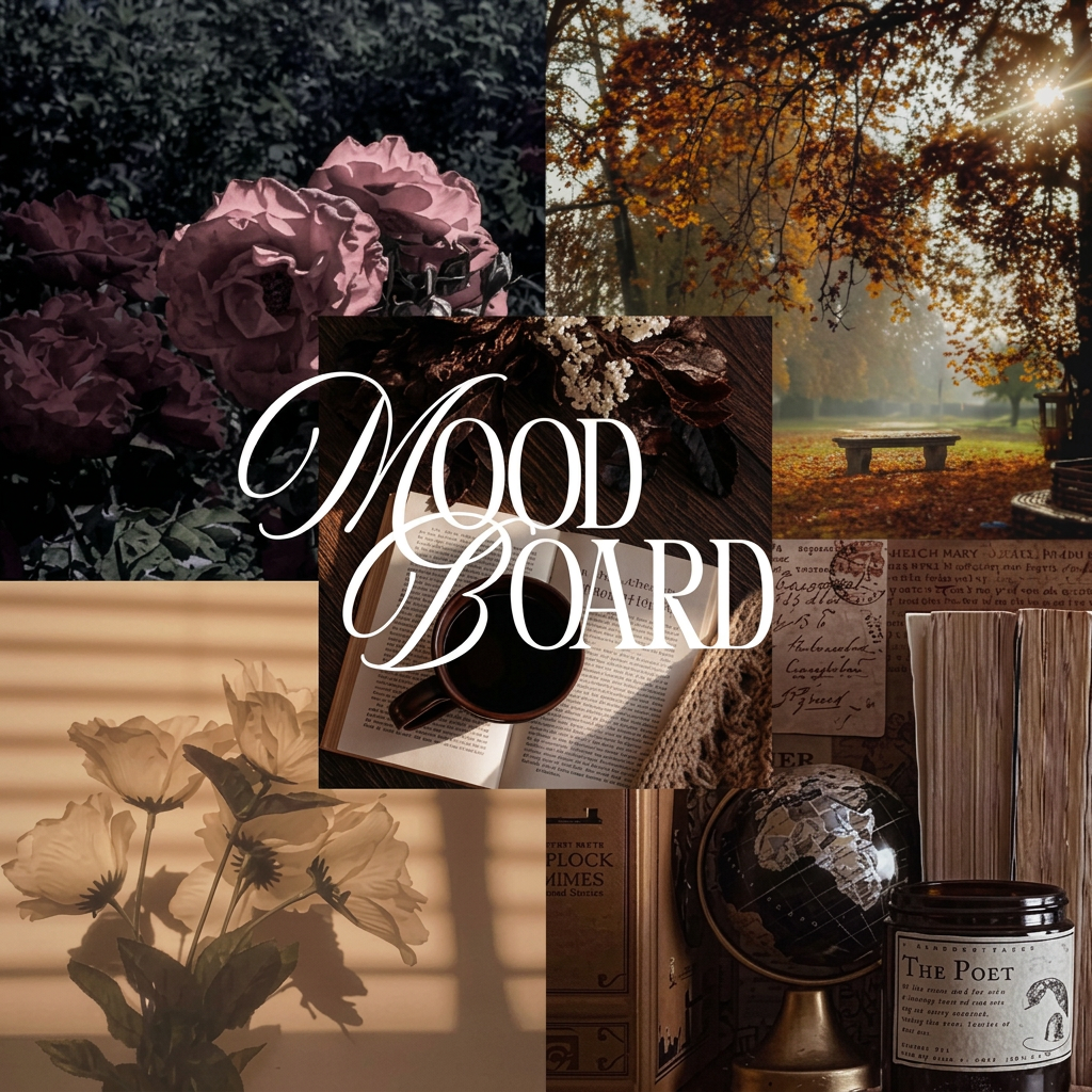
Curated Nostalgia Moodboard: Establishing an intentional editorial world through muted roses, golden hour foliage, vintage typography, and warm interior shadows.

PHASE 03
PAPER-TO-PIXEL TRANSFORMATIONS

Students bridged raw pencil sketching with digital execution in Canva—turning notebook geometry into polished style tiles and high-contrast graphics.

STYLE TILE SYSTEM

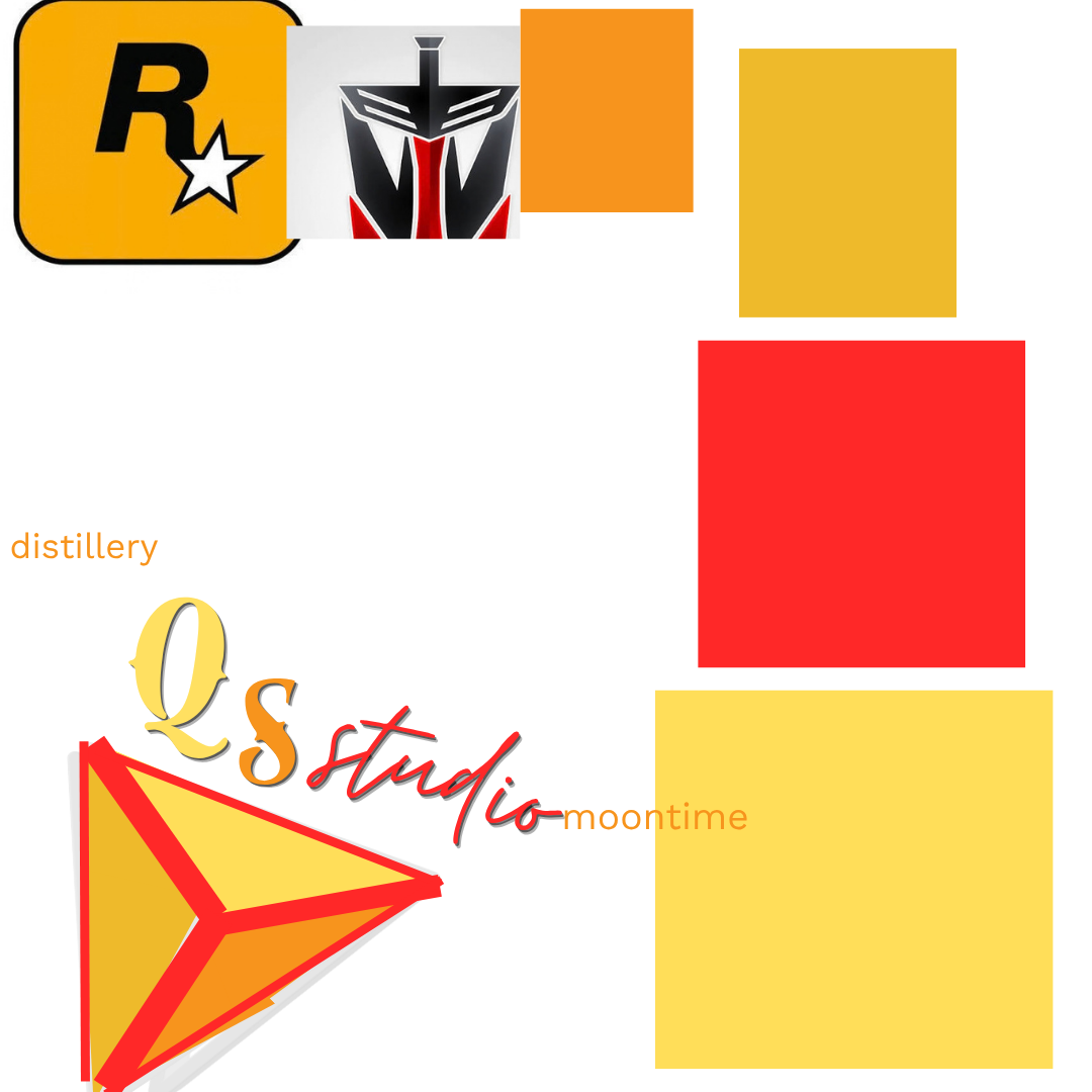
QS STUDIO

“Quality Especial Developer Studios”

Starting on paper with geometric pyramid thumbnails, the student built a complete digital style tile in Canva—pairing a 3D prism emblem with a 4-color warm hierarchy (red, orange, gold, yellow) and display typography.

MONOGRAM & DIGITAL ART

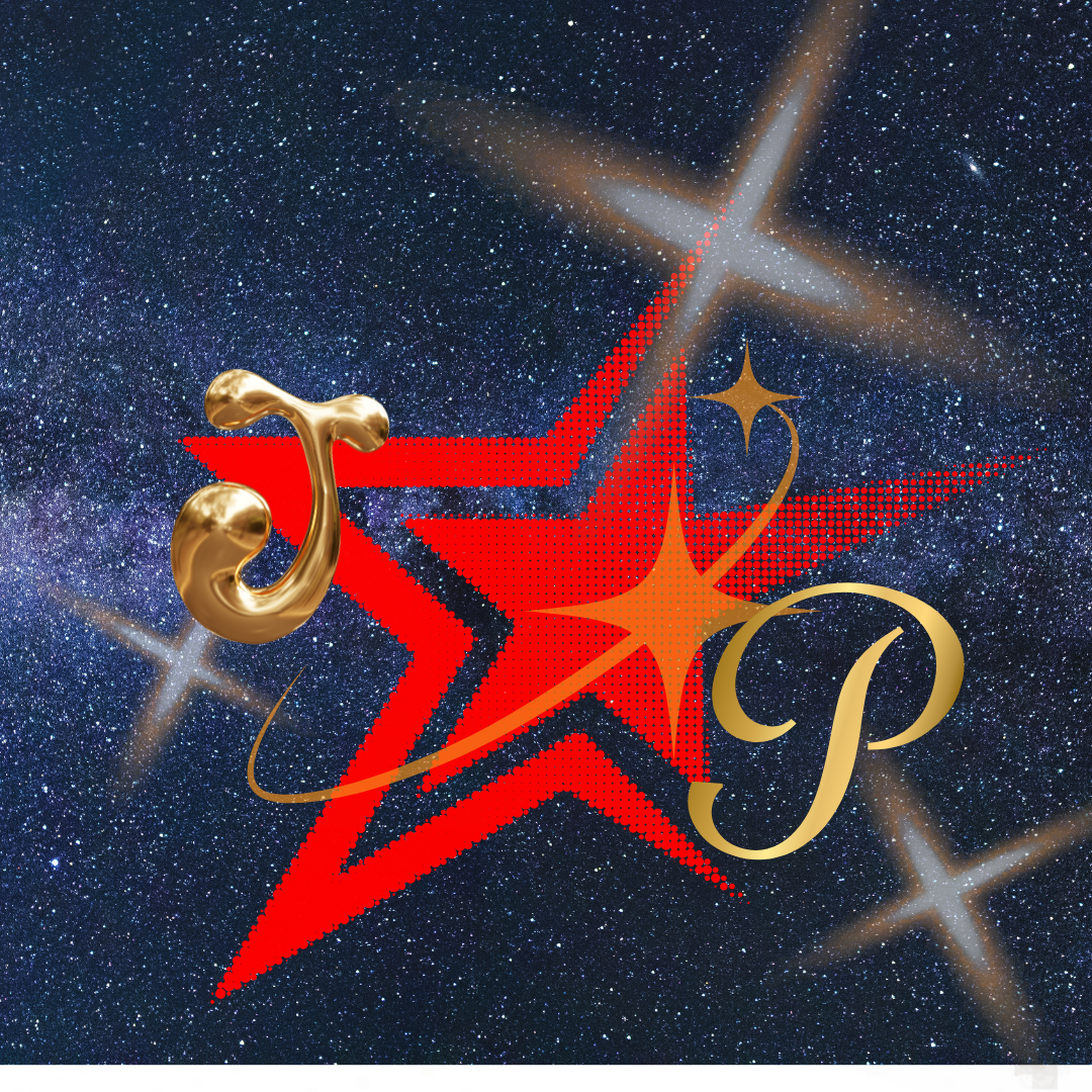
JP COSMIC EMBLEM

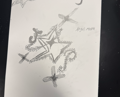
By Angel Mora · From Hand-Drawn Star to 3D Metallic Graphic

Angel drafted an intricate thorny star emblem, four-point flares, and custom “JP” calligraphy on paper before translating the layout into a cosmic nebula graphic featuring a red halftone star and 3D gold lettering.

PHASE 04
CONCEPT LAB: CHARACTER, PACKAGING & ICONOGRAPHY

Across the room, students explored mascot design, festival badges, streetwear geometry, product packaging, and botanical symbols.

ILLUSTRATIVE ICONOGRAPHY

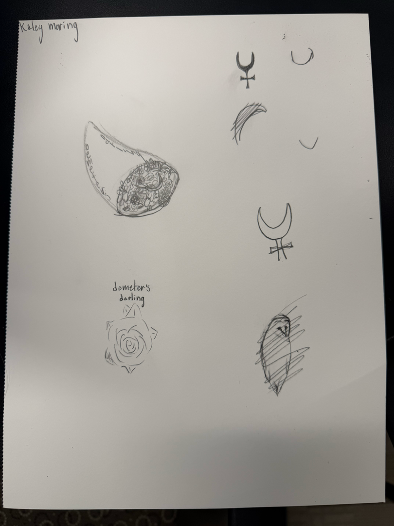
DEMETER’S DARLING

By Kaley Moring · Botanical & Celestial Marks

Translated her retro botanical brief (“Grow up with the trees!”) into delicate hand-drawn symbols—exploring a floral cornucopia, a geometric rose emblem, crescent-moon alchemy marks, and a hatched owl illustration.

MASCOT & LETTERING

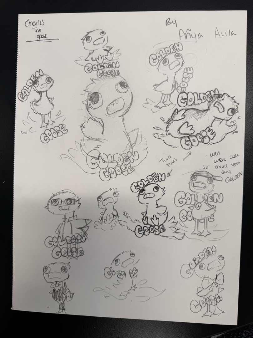
GOLDEN GOOSE

By Aña Avila · “Honk honk sure to make your day GOLDEN”

An expressive character sheet exploring multiple mascot poses, emotive facial dynamics (“Charles the Goose”), and custom bubble-lettering lockups.

APPAREL & GEOMETRY

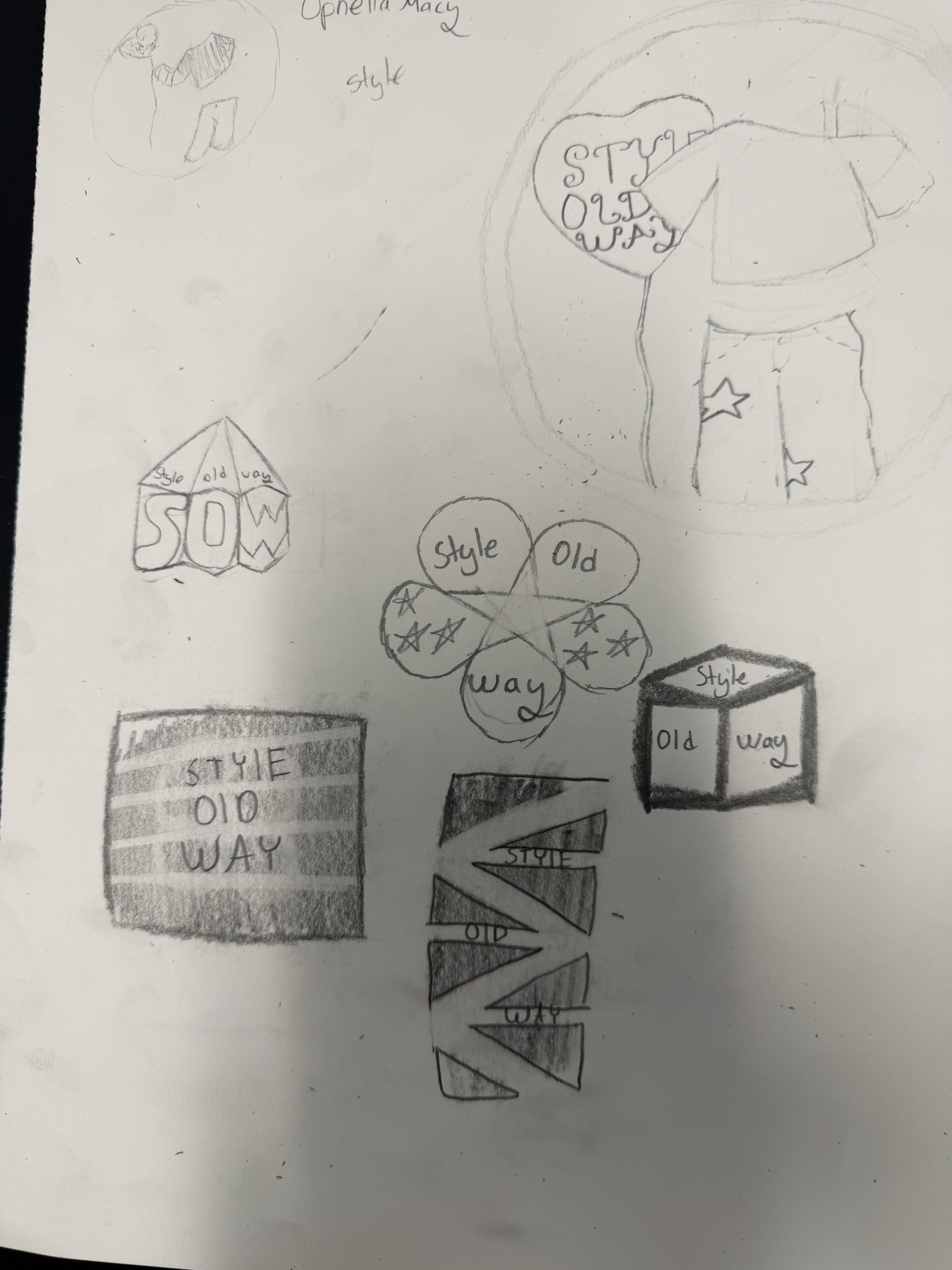
STYLE OLD WAY (SOW)

By Ophelia Macy · Structural Badge & Streetwear System

Tested five distinct visual directions—including a 3D isometric cube, a 5-petal star emblem, high-contrast negative-space zigzags, and custom star-denim apparel mockups.

PRODUCT & PACKAGING

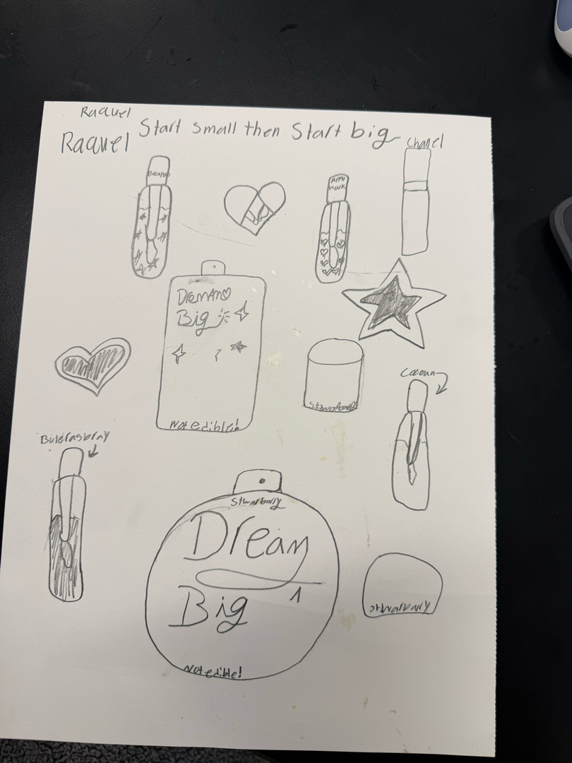
DREAM BIG

By Raquel · “Start small then Start big”

Mapped out a cohesive beauty and fragrance packaging line featuring custom bottle silhouettes, scent variants (Strawberry, Coconut, Blueberry, Apple), and compact mirror graphics.

PROMPT #05 · FESTIVAL IDENTITY

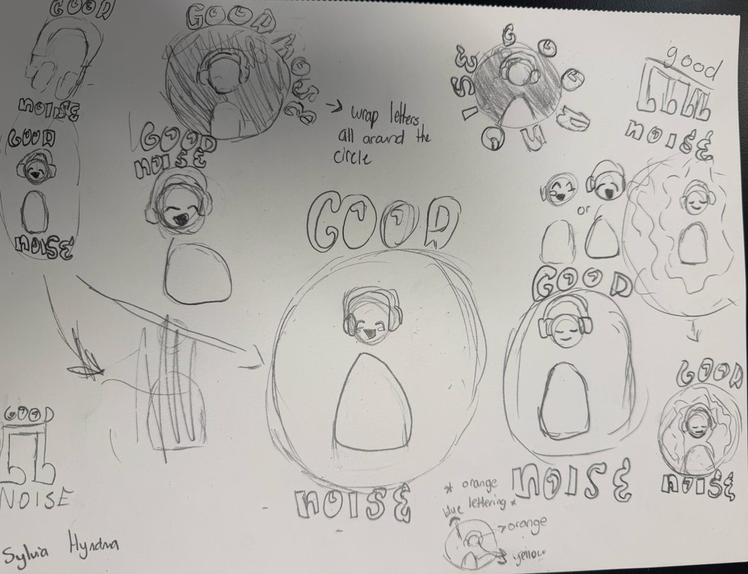
GOOD NOISE

By Sylvia · Youth Music & Mental-Wellness Festival

Responding to Agency Prompt #05, Sylvia explored circular headphone character badges, soundbar typography, radial text wrapping (“wrap letters all around the circle”), and high-energy orange, yellow, and blue color notes.

Brief-to-Sketch Connection: Translated the festival’s dual mission—high-volume youth music and calm mental wellness—into expressive headphone character states and soundwave emblems.

“When you hand young creatives an agency-grade brief instead of a basic art assignment, their strategic thinking sky-rockets. Watching these students connect deep audience empathy to color psychology, typography, and original sketching in just three hours proved how powerful structured creative pipelines can be.”

— Brandon Coley, Founder & Creative Director, BKX Studio